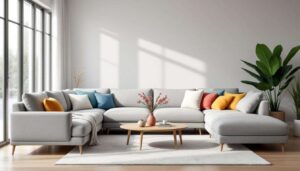
The colour of your kitchen cabinets can dramatically influence the perceived value and sophistication of your entire kitchen space. Choosing the right shade is not merely about personal preference; it involves understanding which tones naturally convey luxury, quality and timeless appeal. From classic whites to rich, dramatic hues, certain colours consistently elevate the aesthetic of any kitchen, making even modest spaces appear more refined and expensive.
The shades of white: timeless elegance
Soft white variations for warmth
White kitchen cabinets remain the gold standard for conveying luxury and sophistication. However, the soft white shades with warm undertones have emerged as particularly effective choices for creating an expensive appearance. Unlike stark, clinical whites, these warmer variations introduce depth and character whilst maintaining the bright, airy quality that makes kitchens feel spacious and inviting.
These nuanced whites work exceptionally well when paired with:
- Natural wood finishes that add organic texture
- Brushed gold hardware for a touch of glamour
- Marble or quartz countertops in complementary tones
- Warm lighting fixtures that enhance the undertones
Creating visual interest with white
The key to making white cabinets look expensive lies in the quality of materials and finishes. Matte finishes have gained considerable popularity, offering a sophisticated texture that appears more refined than traditional glossy surfaces. Lacquered doors in soft white provide a smooth, flawless appearance that immediately signals quality craftsmanship.
| White Shade Type | Best Pairing | Luxury Factor |
|---|---|---|
| Warm soft white | Brass hardware, oak floors | High |
| Creamy white | Marble counters, gold accents | Very high |
| Off-white | Natural stone, mixed metals | High |
Beyond the colour itself, the construction quality significantly impacts the overall impression. Frameless cabinets in white offer a sleeker, more modern appearance that enhances the luxurious feel, though framed options can work equally well when executed with precision and high-quality materials.
Whilst white provides a foundation of elegance, other neutral tones offer equally compelling options for those seeking a sophisticated kitchen aesthetic.
Warm taupe: neutral sophistication
The versatility of taupe tones
Taupe represents an elegant middle ground between beige and grey, offering depth without overwhelming the space. This sophisticated neutral has experienced a resurgence, particularly amongst homeowners seeking a departure from traditional whites whilst maintaining a sense of refinement. The beauty of taupe lies in its adaptability to various design styles, from minimalist contemporary to classic traditional kitchens.
Warm taupe cabinets create a balanced, grounded atmosphere that feels both inviting and expensive. The colour naturally suggests quality and thoughtful design, particularly when combined with premium materials and finishes.
Pairing taupe for maximum impact
To maximise the luxurious appearance of taupe cabinets, consider these strategic combinations:
- Quartz countertops in complementary neutral tones
- Brushed nickel or aged brass hardware
- Natural stone backsplashes with subtle veining
- Warm wood flooring in medium to dark tones
- Pendant lighting with metallic finishes
The matte finish works particularly well with taupe, as it enhances the sophisticated, understated quality of the colour. Lacquered doors in taupe shades available in the RAL K5 chart provide numerous options for achieving precisely the right tone to complement your overall design vision.
Taupe’s neutral nature makes it an excellent foundation, but for those seeking a bolder statement of luxury, deeper hues offer compelling alternatives.
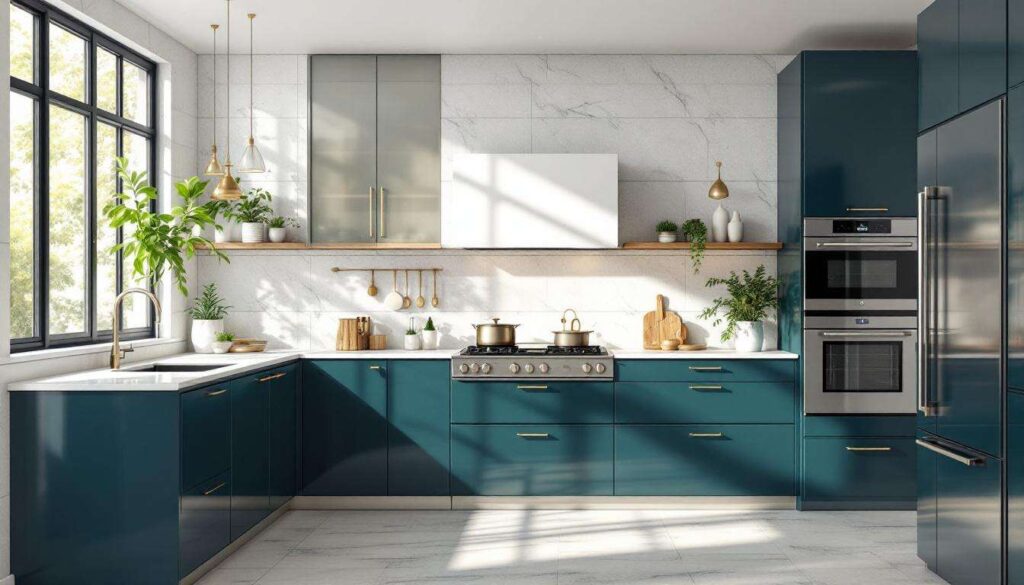
Deep navy blue: bold and classic choice
Navy as a statement of confidence
Deep navy blue cabinets make an unmistakably luxurious statement in any kitchen. This rich, saturated colour conveys confidence, sophistication and timeless appeal. Unlike lighter blues that can feel casual or coastal, navy possesses a formal elegance that immediately elevates the perceived value of the space.
Navy blue works exceptionally well in both traditional and contemporary settings, demonstrating remarkable versatility despite its boldness. The colour creates dramatic visual interest whilst maintaining a classic sensibility that ensures longevity in design appeal.
Enhancing navy with strategic accents
The key to making navy cabinets appear truly expensive lies in thoughtful pairing with complementary elements:
| Element | Recommended Choice | Effect |
|---|---|---|
| Countertops | White marble, light quartz | Creates striking contrast |
| Hardware | Brushed gold, polished nickel | Adds luxurious sparkle |
| Backsplash | White subway tile, marble | Balances the darkness |
| Flooring | Light wood, pale stone | Prevents heaviness |
Light countertops paired with navy cabinets create a sophisticated contrast that feels both fresh and elegant. Brushed gold hardware adds a particularly luxurious touch, whilst nickel options provide a cooler, equally refined alternative. The quality of the cabinet construction becomes especially important with darker colours, as any imperfections are more visible. Frameless construction offers a sleeker appearance that complements the modern luxury navy conveys.
Whilst navy makes a bold statement, nature-inspired hues offer a different path to sophisticated luxury.
Soothing greens: natural inspiration
The rise of sophisticated green tones
Green kitchen cabinets have evolved beyond country cottage aesthetics to become a symbol of refined, contemporary luxury. Soothing green shades, particularly deeper sage, forest and olive tones, bring a sense of natural elegance that feels both current and timeless. These colours create an organic sophistication that appeals to those seeking a connection to nature without sacrificing style.
The most expensive-looking greens tend to be muted, complex shades rather than bright or primary tones. These sophisticated hues suggest thoughtful design choices and quality craftsmanship.
Creating harmony with green cabinets
To maximise the luxurious potential of green cabinetry, consider these complementary elements:
- Natural stone countertops with grey or cream veining
- Brass or bronze hardware for warmth
- Wood elements in natural or light stained finishes
- Neutral backsplashes that allow the green to shine
- Warm metallic light fixtures
The material quality becomes particularly important with green cabinets. High-quality materials that mimic natural wood whilst offering durability provide an excellent foundation. Matte finishes enhance the sophisticated, earthy quality of green tones, whilst lacquered options in carefully selected shades from the RAL K5 chart ensure precise colour matching and a flawless appearance.
Green offers natural warmth, but for those preferring cooler neutrals, grey presents an equally compelling option.
Charcoal grey: the new chic neutral
Grey as the modern luxury standard
Charcoal grey has emerged as the contemporary alternative to traditional neutrals, offering sophistication without the starkness of black or the commonality of lighter greys. This deep, rich neutral conveys a sense of modern luxury that feels both current and enduring. Charcoal grey cabinets create a dramatic yet refined backdrop that works beautifully in minimalist and traditional kitchens alike.
The colour’s popularity stems from its ability to appear expensive whilst remaining versatile and adaptable to various design schemes. Unlike trendy colours that may date quickly, charcoal grey possesses a timeless quality that ensures lasting appeal.
Maximising the luxury of grey
Strategic design choices amplify the expensive appearance of charcoal grey cabinets:
| Design Element | Luxury Option | Impact |
|---|---|---|
| Cabinet finish | Matte lacquer | Sophisticated texture |
| Hardware | Polished chrome, brass | Refined contrast |
| Countertops | White quartz, marble | Elegant balance |
| Construction | Frameless design | Modern, seamless look |
The quality of construction significantly impacts how expensive charcoal grey cabinets appear. Frameless cabinets offer superior accessibility and a sleeker aesthetic, though they typically command a higher price point. The investment proves worthwhile, as the modern, seamless appearance enhances the overall sense of luxury. Matte finishes work particularly well with charcoal grey, creating a sophisticated surface that appears both contemporary and refined.
Whilst grey offers cool sophistication, warmer dark tones provide an alternative route to luxurious appeal.
Chocolate brown: cosy and refined
The warmth of rich brown tones
Chocolate brown cabinets deliver warmth and richness that few other colours can match. This deep, inviting shade creates an atmosphere of cosy refinement, suggesting quality craftsmanship and thoughtful design. Unlike lighter browns that can appear dated, rich chocolate tones convey a sense of established elegance and enduring style.
Brown cabinets work particularly well in kitchens seeking a traditional or transitional aesthetic, though they can also complement contemporary designs when paired with modern elements and finishes.
Elevating brown to luxury status
To ensure chocolate brown cabinets appear expensive rather than ordinary, focus on these key elements:
- High-quality wood or wood-like materials with visible grain
- Cream or beige countertops for warmth
- Antique brass or oil-rubbed bronze hardware
- Natural stone backsplashes with warm undertones
- Adequate lighting to prevent the space feeling dark
The material selection proves crucial with brown cabinets. Whilst solid wood represents the ultimate luxury, high-quality laminate wood can effectively mimic natural wood without the associated cost, provided the finish and construction quality remain high. Matte and satin finishes enhance the natural, organic quality of brown, whilst proper lighting ensures the rich colour appears warm rather than oppressive.
Cabinet style also influences the luxury perception. Framed cabinets can work well with traditional brown cabinetry, offering a classic appearance, though frameless options provide a more contemporary interpretation of this warm, inviting colour.
Selecting kitchen cabinet colours that convey luxury requires balancing personal preference with proven design principles. Soft whites offer timeless elegance, whilst warm taupe provides sophisticated neutrality. Deep navy blue makes a bold classic statement, and soothing greens bring natural inspiration. Charcoal grey represents modern chic neutrality, whilst chocolate brown delivers cosy refinement. Regardless of colour choice, the quality of materials, finishes and construction ultimately determines whether cabinets appear truly expensive. Matte finishes, quality hardware and thoughtful pairings with countertops and backsplashes elevate any colour choice, transforming ordinary kitchens into spaces of genuine luxury and enduring appeal.