
Guest bedrooms present a unique design challenge, requiring a delicate equilibrium between aesthetic appeal and genuine comfort. The colours chosen for these spaces can profoundly influence how welcomed visitors feel upon arrival. Designers consistently highlight one particular shade that undermines the warm, restful atmosphere essential for overnight guests, whilst simultaneously championing alternatives that transform these rooms into havens of tranquillity.
The colour to avoid: what designers say
The pitfalls of cold grey
Interior designers overwhelmingly identify cold grey as the primary colour to eliminate from guest bedroom palettes. Whilst this shade has enjoyed popularity in contemporary minimalist design, its application in guest spaces frequently backfires. The issue lies not with grey itself, but specifically with cold-toned greys that possess blue or stark undertones, creating an atmosphere that feels clinical rather than comforting.
This colour choice presents several distinct problems:
- It generates a sterile, unwelcoming environment reminiscent of institutional settings
- Cold greys absorb natural light rather than reflecting it, making rooms feel darker and smaller
- The shade can evoke feelings of melancholy or unease, particularly in spaces lacking abundant sunlight
- Guests may perceive the room as impersonal or neglected
Why warmth matters in guest spaces
The fundamental purpose of a guest bedroom extends beyond merely providing a place to sleep. These rooms communicate hospitality and care, signalling to visitors that their comfort has been thoughtfully considered. Cold grey undermines this message, creating psychological distance when connection is desired. Design professionals emphasise that colour temperature directly impacts emotional response, making warm tones essential for spaces dedicated to rest and relaxation.
Understanding which colours to embrace instead becomes crucial for achieving the desired welcoming effect.
Soothing alternatives for a guest bedroom
Warm pastels that brighten
Designers recommend warm pastel shades as excellent substitutes for cold grey. These colours introduce softness whilst maintaining sophistication. Particularly effective options include hues with subtle green or coral undertones, which enhance natural light in rooms that face north or receive limited sunshine. These shades create an uplifting atmosphere without overwhelming the senses, striking an ideal balance for guest accommodation.
| Colour category | Effect on space | Best for |
|---|---|---|
| Warm pastels | Brightens and energises | North-facing rooms |
| Creamy whites | Reflects light, creates airiness | Small or dark spaces |
| Rich deep tones | Adds depth and cosiness | Larger rooms with good light |
| Textured neutrals | Sophisticated backdrop | Any room size |
The versatility of creamy whites
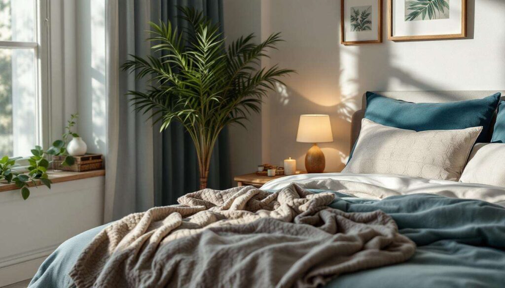
Creamy white tones offer remarkable flexibility for guest bedrooms. Unlike stark, cold whites that can feel harsh, warmer white variations reflect light beautifully whilst maintaining a cosy quality. These shades serve as excellent foundations for layering textures and accessories, allowing guests to feel enveloped in comfort rather than exposed to clinical brightness.
Bold hues for character
Contrary to conventional wisdom suggesting neutral safety, many designers advocate for rich, saturated colours in guest bedrooms. Deep navy, forest green, or warm terracotta can transform a space into a luxurious retreat. These bold choices create a cocoon-like environment that feels intentional and sophisticated, particularly effective in smaller rooms where they add unexpected depth.
Textured neutrals as sophisticated foundations
Soft taupes, warm beiges, and greige (grey-beige hybrids with warm undertones) provide elegant alternatives to cold grey. These textured neutrals maintain visual interest whilst supporting rather than dominating the space. They allow flexibility for seasonal updates through bedding and accessories, ensuring the room never feels dated or stale.
Once appropriate colours are selected, ensuring they complement the broader home aesthetic becomes the next consideration.
Harmonising with the rest of the home
Creating visual flow
Guest bedrooms need not match other rooms identically, but they should maintain visual coherence with the overall home aesthetic. Consider undertones present throughout your property: if warm woods and golden hues dominate communal spaces, introducing cool greys in the guest room creates jarring disconnection. Instead, select guest bedroom colours that echo or complement existing palette choices, ensuring visitors experience seamless transition as they move through your home.
Balancing distinction with cohesion
Achieving the right balance involves:
- Identifying dominant undertones in adjacent spaces
- Selecting guest room colours from the same temperature family
- Using accent colours that appear elsewhere in the home
- Maintaining consistent finish levels (matte, satin, or gloss) throughout
This approach allows guest bedrooms to possess distinct personality whilst feeling integrated rather than isolated. The room becomes a thoughtful extension of your home’s character rather than an afterthought.
Beyond colour selection, the overall atmosphere created through design choices determines guest comfort levels.
Creating a welcoming and relaxing space
The psychology of comfort
Colour represents just one element in crafting a genuinely welcoming guest bedroom. The most successful spaces combine appropriate colour choices with thoughtful attention to comfort details. Lighting plays a crucial role: harsh overhead fixtures should be supplemented with softer bedside options, allowing guests to adjust ambiance according to preference. Temperature control, quality bedding, and adequate storage for belongings all contribute to the psychological sense of welcome that transforms a room from merely functional to genuinely hospitable.
Layering for depth
Creating relaxing environments requires layering multiple elements:
- Varied light sources at different heights
- Multiple textile textures in bedding, curtains, and rugs
- Personal touches that suggest care without overwhelming
- Practical amenities such as reading materials, water, and charging stations
These layers work synergistically with colour choices to establish spaces where guests feel genuinely cared for rather than merely accommodated.
The freedom to experiment
Guest bedrooms offer unique opportunities for design experimentation. Since these spaces aren’t occupied daily, homeowners can embrace bolder choices without concern about tiring of them. This freedom allows for creative expression that might feel risky in personal bedrooms, making guest rooms ideal testing grounds for colours and patterns that add personality and distinction.
Accessories provide the finishing touches that elevate guest bedrooms from adequate to exceptional.
The art of using accessories
Strategic accent placement
Accessories transform colour schemes from theoretical to tangible. Once wall colours are established, carefully selected accessories bring the palette to life. Consider throw cushions, artwork, lampshades, and decorative objects that introduce complementary hues whilst reinforcing the warm, welcoming atmosphere. These elements should feel curated rather than cluttered, with each piece serving both aesthetic and functional purposes.
Textiles as transformative elements
Bedding, curtains, and rugs offer opportunities to introduce pattern and additional colour dimensions. When working with neutral wall colours, textiles can provide visual interest without overwhelming. Conversely, bold wall colours benefit from simpler textile choices that allow the architecture to shine. Quality matters significantly: luxurious fabrics communicate care and attention, enhancing the guest experience considerably.
Personal touches without personalisation
The most successful guest bedrooms include thoughtful details that suggest hospitality without imposing the host’s personality too heavily. Fresh flowers, quality toiletries, and carefully chosen artwork create welcoming environments whilst allowing guests to feel the space is temporarily theirs. This delicate balance distinguishes truly exceptional guest accommodation from merely adequate provision.
Current design movements offer fresh inspiration for reimagining guest bedroom spaces.
Trends and inspirations for guest bedrooms
Contemporary approaches to guest accommodation
Recent design trends emphasise flexibility and multifunctionality in guest bedrooms. Many homeowners now create spaces that serve dual purposes, functioning as home offices or hobby rooms when guests aren’t present. This practical approach influences colour choices, favouring versatile neutrals and warm tones that support various activities whilst maintaining the welcoming quality essential for overnight visitors.
Sustainable and timeless choices
Current movements away from fast-changing trends favour timeless colour palettes that endure beyond seasonal fashions. This approach proves particularly appropriate for guest bedrooms, where longevity matters more than cutting-edge trendiness. Warm, nature-inspired hues—soft terracottas, sage greens, warm ochres—provide enduring appeal whilst supporting the relaxation essential for quality rest.
Drawing inspiration thoughtfully
When seeking inspiration for guest bedroom design, consider:
- Boutique hotel aesthetics that prioritise guest comfort
- Natural environments that promote relaxation
- Personal travel experiences in memorable accommodations
- Cultural colour traditions that emphasise hospitality
These sources offer authentic inspiration rooted in genuine hospitality principles rather than superficial aesthetic trends.
Guest bedroom design ultimately centres on creating spaces where visitors feel genuinely welcomed and cared for. Avoiding cold grey in favour of warmer alternatives—whether soft pastels, creamy whites, bold rich tones, or textured neutrals—establishes the foundation for successful guest accommodation. When combined with thoughtful attention to comfort details, appropriate accessories, and harmonious integration with the broader home aesthetic, these colour choices transform functional spaces into memorable retreats. The most effective guest bedrooms balance personal style with universal comfort principles, ensuring every visitor experiences the warmth and hospitality that colour choices can powerfully communicate.