
Professional interior designers approach trim colour selection with a methodical strategy that transforms ordinary rooms into cohesive, polished spaces. The trim—comprising skirting boards, door frames, window surrounds, and architraves—serves as the architectural framework that defines and accentuates a room’s character. Rather than treating these elements as afterthoughts, experienced designers recognise that trim colour choices profoundly influence how wall colours appear, how light moves through a space, and how the eye navigates from one architectural feature to another. The decision requires careful consideration of multiple factors, from undertones and lighting conditions to the desired atmosphere and architectural style.
Understanding the importance of trim colour
The architectural framework of interior spaces
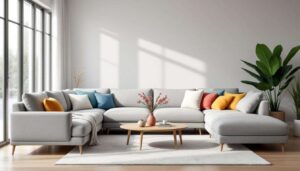
Trim colour establishes the visual boundaries that define a room’s structure. Unlike walls, which provide expansive colour fields, trims create linear elements that guide the eye and emphasise architectural details. Professional designers understand that these painted surfaces function as more than decorative accents—they frame doorways, outline windows, and anchor walls to floors and ceilings.
The relationship between trim and architecture determines whether features appear prominent or recede into the background. A contrasting trim colour draws attention to mouldings, panelling, and period details, whilst a tone-on-tone approach creates seamless transitions that emphasise wall colour instead. This fundamental principle allows designers to control visual hierarchy within a space.
Supporting the design narrative
Every room tells a story through its colour palette, and trim colour contributes an essential chapter. Designers select trim shades that support rather than dominate the overall narrative. The trim should complement furniture, textiles, and decorative elements without competing for attention.
The choice depends on what deserves emphasis:
- Highlighting artwork and furniture through neutral trim backgrounds
- Showcasing architectural details with contrasting trim colours
- Creating visual flow by matching trim to adjacent room colours
- Establishing period authenticity through historically appropriate choices
This strategic thinking separates professional results from haphazard colour selections. Understanding these foundational principles naturally leads to examining the specific criteria designers employ when evaluating trim colour options.
Selection criteria for a successful trim colour
Timing the decision correctly
Professional designers consistently recommend making trim colour selections after choosing wall colours and major furnishings. This sequence ensures that trim complements the established palette rather than dictating it. The trim functions as the finishing touch that ties together all preceding decisions.
Rushing this decision often results in mismatched undertones or jarring contrasts that undermine an otherwise cohesive scheme. Taking time to observe how wall colours appear throughout the day, how furniture interacts with those colours, and how natural light affects the space provides essential context for trim selection.
Evaluating undertones and compatibility
The most common mistake involves selecting trim colours based solely on surface appearance without considering undertones. A seemingly neutral white may contain yellow, blue, pink, or green undertones that clash with wall colours or create unintended effects.
| Undertone | Best paired with | Avoid pairing with |
|---|---|---|
| Warm (yellow/cream) | Earth tones, warm neutrals | Cool greys, blue-based colours |
| Cool (blue/grey) | Cool greys, blues, greens | Warm beiges, terracotta |
| Pink | Soft neutrals, blush tones | Yellow-based colours |
| Green | Natural tones, sage, olive | Pure whites, stark contrasts |
Assessing architectural style and period
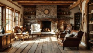
The architectural character of a property influences appropriate trim colour choices. Victorian homes traditionally featured high-contrast trim that emphasised ornate mouldings, whilst contemporary spaces often employ subtle tonal variations. Designers respect these historical contexts whilst adapting them to modern preferences.
Period-appropriate selections enhance authenticity without creating museum-like environments. A Georgian townhouse might feature off-white trim against muted wall colours, whilst a mid-century modern home could showcase trim in the same shade as walls for seamless surfaces. With these criteria established, the next consideration involves creating harmonious relationships between trim and wall colours.
How to harmonise trim colour with wall colour
The classic contrast approach
Traditional interior design relies on contrasting trim and wall colours to define architectural features. White or off-white trim against coloured walls remains the most popular choice, providing crisp definition and visual clarity. This approach works particularly well in rooms with interesting architectural details worth highlighting.
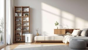
However, stark brilliant white can appear harsh and compete with other design elements. Designers increasingly favour softer whites with subtle undertones that complement rather than contrast sharply. These gentler whites maintain definition whilst creating more sophisticated, cohesive schemes.
Tone-on-tone sophistication
Contemporary design often employs trim colours closely matched to wall shades, creating seamless, flowing spaces. This technique works exceptionally well in:
- Modern and minimalist interiors seeking clean lines
- Small rooms where high contrast creates visual fragmentation
- Spaces with limited architectural detail
- Open-plan areas requiring visual continuity
The tone-on-tone approach typically uses trim colours one or two shades lighter or darker than walls, providing subtle definition without obvious contrast. This method emphasises wall colour and creates calm, unified environments.
Complementary colour strategies
Rather than matching or contrasting, some designers select trim colours that complement wall shades through colour theory. A room with sage green walls might feature trim in a warm cream that shares yellow undertones, creating harmony through related hues rather than contrast or matching.
This sophisticated approach requires understanding colour relationships and how undertones interact. When executed successfully, complementary trim colours enhance wall colours whilst maintaining distinct architectural definition. The colour selection process connects intimately with finish choices, which significantly affect final appearance.
Considering the paint finish for trims
Durability and practical performance
Trim surfaces endure more wear than walls, accumulating scuffs, fingerprints, and impact damage. Professional designers specify durable finishes that withstand cleaning and maintain appearance over time. The finish selection balances aesthetic preferences with practical requirements.
Higher sheen levels provide superior durability and cleanability:
- Gloss: maximum durability, highly reflective, emphasises imperfections
- Semi-gloss: excellent durability, moderate reflection, most popular choice
- Satin: good durability, subtle sheen, softer appearance
- Eggshell: moderate durability, minimal sheen, contemporary preference
Visual impact of sheen levels
Paint finish dramatically affects how trim colour appears and interacts with light. Higher sheen levels reflect more light, making colours appear lighter and more vibrant whilst creating visual contrast against matte wall finishes. This reflectivity draws attention to trim details and architectural features.
Conversely, lower sheen finishes create subtle, sophisticated effects that blend more seamlessly with walls. Modern interiors increasingly favour satin or eggshell trim finishes that provide durability without the traditional high-gloss appearance. The finish choice should align with the overall design aesthetic and period appropriateness.
Matching finish to room function
Different rooms require different performance characteristics. High-traffic areas, kitchens, and bathrooms benefit from semi-gloss or gloss finishes that resist moisture and clean easily. Bedrooms and formal spaces can employ lower sheen finishes for softer, more refined appearances.
| Room type | Recommended finish | Rationale |
|---|---|---|
| Bathrooms | Semi-gloss or gloss | Moisture resistance, easy cleaning |
| Kitchens | Semi-gloss | Grease resistance, wipeable surface |
| Hallways | Semi-gloss or satin | High traffic durability |
| Bedrooms | Satin or eggshell | Softer appearance, adequate durability |
Once colour and finish parameters are established, designers employ specific testing methods to confirm their selections before committing to entire rooms.
Designers’ tips for testing trim colour
Sample boards and in-situ testing
Professional designers never rely on paint chips alone. They create sample boards painted with actual trim colours and observe them in the intended space under various lighting conditions. This process reveals how colours appear against wall shades, flooring, and furnishings throughout the day.
The testing process should include:
- Painting large samples on white poster board or directly on trim sections
- Observing samples in morning, afternoon, and evening light
- Viewing samples under artificial lighting conditions
- Placing samples against wall colours and adjacent to furnishings
- Living with samples for several days before deciding
Understanding lighting influences
Natural and artificial light dramatically affect trim colour appearance. North-facing rooms receive cool, bluish light that enhances cool undertones, whilst south-facing spaces bathe in warm, yellow light that intensifies warm undertones. Designers account for these variables when testing colours.
Artificial lighting introduces additional complexity. Warm LED bulbs enhance yellow undertones, cool LEDs emphasise blue tones, and colour-rendering index (CRI) affects how accurately colours appear. Testing trim samples under the actual lighting conditions ensures no unpleasant surprises after painting.
Comparing multiple options simultaneously
Rather than testing colours sequentially, designers evaluate multiple options side by side. This comparative approach reveals subtle differences that might otherwise go unnoticed. Placing three to five trim colour samples together highlights which option provides the most harmonious relationship with walls and furnishings.
This methodical testing process prevents costly mistakes and ensures confident colour selection. Whilst traditional approaches favour neutral trim colours, contemporary design increasingly embraces bolder choices that create distinctive, modern effects.
Using bold trim colours for a modern effect
Creating architectural drama
Contemporary designers challenge conventional wisdom by employing bold trim colours that make powerful design statements. Dark charcoal, navy, black, or rich earth tones transform trim from background element to prominent feature. This approach works particularly well in spaces with interesting architectural details deserving emphasis.
Bold trim colours create visual weight and sophistication whilst grounding spaces in contemporary aesthetics. A room with pale walls and dark trim achieves dramatic contrast that feels fresh and modern rather than traditional. This technique suits confident design schemes and clients seeking distinctive interiors.
Coordinating with contemporary palettes
Bold trim colours require careful coordination with overall colour schemes. Successful implementations typically involve:
- Repeating the trim colour in furnishings or accessories
- Selecting trim shades that complement rather than clash with wall colours
- Considering how bold trim affects room proportions and ceiling height
- Balancing dark trim with adequate natural and artificial lighting
Dark trim can make rooms feel smaller and cosier, which may be desirable in large, impersonal spaces but problematic in compact rooms. Designers evaluate spatial characteristics before recommending bold trim choices.
Trending colours for modern trims
Current design trends favour specific bold trim colours that create sophisticated, contemporary effects. Deep charcoal and black provide maximum contrast and modern edge. Rich browns and bronzes offer warmth whilst maintaining contemporary sophistication. Deep greens and navies introduce colour whilst remaining grounded and versatile.
These trending choices reflect broader movements towards earthy, natural palettes and darker, moodier interiors. They work particularly well in period properties seeking contemporary updates that respect architectural heritage whilst embracing modern aesthetics.
Selecting the perfect trim colour requires balancing multiple considerations, from undertones and lighting to architectural style and personal preference. Professional designers approach this decision methodically, testing options thoroughly and considering how trim colour supports the broader design narrative. Whether choosing classic white trim for timeless elegance or bold dark shades for contemporary drama, the key lies in ensuring trim complements rather than competes with other design elements. By following these professional strategies, anyone can achieve trim colour selections that enhance architectural features, harmonise with wall colours, and create polished, cohesive interiors that stand the test of time.